
Adding Collaboration to Procreate
A class project with Minnie Chau, Rhiannon Lang, Janet Wong, and myself

For my Data-Driven UX & Product Design course I formed a team with 3 peers and we worked on adding collaboration to Procreate.
Procreate is a popular iPad-based art application widely used in the art industry by professional and recreational artists. However, Procreate users currently lack streamlined collaboration features due to the tedious process of sharing files and the inability to receive direct feedback on an art piece. In 11 discussion threads on Procreate's official forum, users have requested and suggested collaboration features that are similar to Google Drive's ability to collaborate in-real-time and its Cloud capabilities. Adding features like this to Procreate can minimize the effort of using 3rd-party applications and communication delays, and prioritize the time of working simultaneously. Hence, our team wanted to improve Procreate’s collaboration and communication process by making it more efficient to do collaborative tasks such as drawing simultaneously, sharing pieces, and making feedback-based edits.

Research Methods
Our main goals for user research were to learn why users utilize Procreate and how those users currently collaborate on Procreate (if they do at all). Our target demographic was young artists (ages 19-34) who frequently collaborate and currently use or are familiar with Procreate, as they would provide the best insight into this type of activity.
We released a Google Form survey to various art-related or college student-based online communities, such as Twitter, Reddit forums (r/Procreate, r/ArtEd, r/UCSD), Discord servers, and to any friends that we knew who are in the art field or use Procreate. We asked about their main usage of Procreate, collaboration experience, and what functions they wished to have to facilitate collaboration. To supplement our data, we conducted user interviews to gain more qualitative insight into their experiences and feelings about the application. Direct observation was not utilized since Procreate does not currently have a way to collaborate in-app, hence it would not be as helpful to observe. Thus far, we have interviewed 8 people and received 16 survey responses, ranging from recreational artists to professional artists.
Research Findings
Most users primarily collaborate by exporting files out of Procreate and sending them to other artists or vice versa. Many users want a cloud storage feature, similar to Google Drive so they could easily share files, make edits, suggest or view comments, and easily access updates. Many also wanted to interact with a file or canvas in-real-time with others. Some other users expressed frustration trying to import and export files, as well as inability to reference images outside the canvas.
-
5/8 of interviewees and 4/17 survey respondents want a live collaboration feature.
-
Users liked “the concept of two people being able to draw at the same time”
-
-
5/8 of interviewees and 4/17 survey respondents want a cloud storage feature.
-
Users had a couple different ideas of what a cloud feature might look like, ranging from specific things like “It would be cool if you can create your own folder and have it as a project folder and add people to have access.” to “similar to google drive”
-
Some users also mentioned that a cloud feature would be useful for not only sharing with other people but also across a singular person’s devices, mentioning that it “would be nice to access files on desktop”
-
-
2/8 of interviewees and 7/17 of survey respondents do not use Procreate to collaborate because they didn’t know they could, or because the app is not suited for collaboration.
-
Other functions that respondents want incorporated into the app include:
-
A chat function (1 survey respondent)
-
Comment feature (2/8 interviews and 4/17 survey respondents)
-
A quote from one of our users encapsulates the desire for this feature,“ I wish that there could be an option that there’s a comment/suggest tool or layer so that you can [draw an] arrow and point to changes you want to make.”
-
-
Easier transfer of files (2/8 interviews and 3/17 survey respondents)
-
Currently there are corruption Issues
-
Currently you have to export each individual animation frame
-
-
-
16/25 total users mentioned that they currently collaborate by exporting files from Procreate and sending them to others outside the app for use in other programs like Photoshop, Canva, Clip Studio Paint, Illustrator and Figma.
Most users rated collaborating on Procreate as average (5), hard (4), and very hard (4). Collaboration on Procreate is clearly a problem that needs to be addressed. The frustrations caused by this difficulty could clearly be seen in the interviews with numerous users mentioning it being “tricky”, “lots of waiting”, and “lots of back and forth”.
.png)
Most users said they collaborate through downloading and sending files to each other (9) or through Photoshop (7). This shows that even if most of the illustration for a piece is happening within the procreate, almost all of the collaboration is happening outside of the app and there is a huge user need not being fulfilled.

Problem Statement
Based on our research findings we came up with the following problem statement
Creative teams need to efficiently share and simultaneously edit files to meet approaching deadlines on projects and create a more fluid and structured work dynamic.
Personas
From our problem statement and user interviews we devised the following personas


Competitive Audit
After our personas we moved onto a competitive audit of top programs that use cloud storage and top programs that use real-time collaboration. Through the competitive audit, we discovered different ways files can be displayed, interacted with, and organized, as well as how commenting and feedback features were implemented in various platforms. In our Procreate redesign, we plan to adopt similar terminology, tools, organization, and sharing systems from the programs we analyzed, while retaining the visual UI of Procreate. Following conventional industry standards by applying familiar language and icons is vital in making it easier for the user to learn and understand the new features we are adding.


UX Flows & Sketches
We made multiple user flows and sketches investigating the different directions we could take the project in
UX Flow 1: Saving files to Procreate’s Cloud storage
This flow was inspired by Google Drive’s cloud storage capability, which enables users to store, access, and collaborate files on any device at any time. Procreate currently lacks the flexibility to create or access files outside of the device, so adding a cloud storage option helps users sync updated files, forgo the hassle of exports and imports, and free up device storage space. A “save to cloud” button is provided in the app, and prompts the user which cloud storage they want to use and what file type to save as. This flow is designed for both our personas, Crystal and Ashok, as they may need to access their files across different devices and users.

.png)
UX Flow 2: Downloading Cloud Files
As of right now Procreate is a strictly Apple-based application, and as such we were inspired by Apple’s use of cloud storage to retrieve files since Procreate currently only retrieves files saved on the device (which proves troublesome when devices crash or need to be factory reset). As such, this UX flow provides the steps of how a user would be able to download shared cloud files. After opening the app, the user will log into their Procreate account and gain access to their cloud storage. From there, they can either open an existing art file or open a new one that is now stored in their Cloud account. Again, this flow is designed for both our personas, if they need to download files from other people they are working with.

.png)
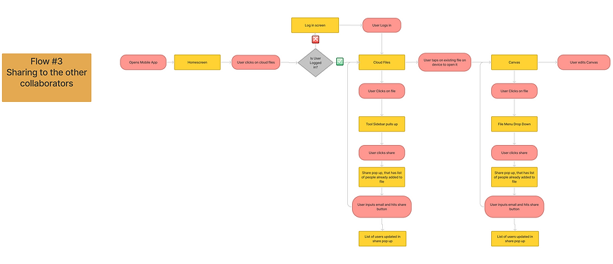
UX Flow 3: Sharing file to other collaborators
For this UX flow, we again were heavily inspired by Google Docs and how users can share their documents with other team members. We gave users the ability to log into their “Procreate” account to gain access to their Cloud files. From there, users can add other team members to their existing or new canvas just like Google Docs via email or if they have the contact already saved in their device then they can be added into the art file. Thus, these new members can now edit and change the art file as they collaborate. For a teacher like Crystal, this feature would be an excellent tool to help her pair up students onto one canvas during practice exercises and for her to give her feedback without having to constantly export files.
.png)
UX Flow 4: Feedback/Commenting
This user flow was inspired by Figma and Google Docs’ commenting feature. Feedback and communication is an important aspect in the collaboration and creative art process, yet Procreate lacks features that enable artists to fluidly do so, requiring them to rely on others’ screenshots or notes (viewed externally outside the application). With this new Procreate feature, users can provide feedback in the form of a text comment or a markup drawing layer, with options to edit, reply, resolve, or delete them. For comic creator Ashok, a drawing layer can be more useful than simply commenting as he can directly draw on the canvas what his intended vision is to anyone in his team. For teacher Crystal, this can help show her students a tangible version of her feedback.


UX Flow 5: Simultaneous Editing
For this UX flow, we wanted to show the process of two users (Person A & B) working on one canvas at the same time. We were inspired by programs such as Drawpile, Figma, and Miro Board who provide users with this feature. In this flow, Person B edits the file first and this edit can be seen by Person A on the canvas, but also by a message stating that the canvas was edited by Person B. This feature is especially useful to our second persona, Ashok as he can see what work his team is doing and give feedback right on the spot.


Prototype 1:
Feedback/Commenting Feature
This prototype implements a commenting and feedback feature in Procreate. By clicking the comment icon, users can view any comments or markup layers that were added in the designated “Comments” box display. Comments are also geographically displayed at a location on the canvas, so that feedback is localized and corresponds to specific areas, instead of an arbitrary position. The red dot over the comment icon indicates there are new, unread updates, in which they can then be viewed, replied to, or resolved. We chose to use a red dot because they are a common signifier in the online world of a new notification or an unread message (figure 1).

Prototype 2:
Cloud Feature (Saving and Sharing)
This prototype implements a cloud-based way of saving and sharing files in Procreate, which can be done in 2 ways: via Gallery, or within a file.
1) Gallery: A user can share from the Gallery screen by tapping Select, selecting file(s), and then sharing via email, account name, or link; file permissions can be modified for each person. This design feature is built within the current parameters of how files are currently operated on in Procreate.
2) Within the file: While Procreate currently autosaves files, it is directly stored in the Procreate app on the iPad device. Our design autosaves files directly to a built-in cloud storage, alleviating the hassle of transferring files to iPad Files storage, iCloud, Google Drive, or Dropbox. Additionally, we included better signifiers to inform users that files are saving to the cloud. One signifier is a “saving to cloud” icon that displays as edits are made, which is similar to how Google Docs informs their users. Another signifier is a large pop-up with a textual statement that says, “Saved to Cloud!”. Sharing files is similar to its Gallery counterpart; the primary difference is there is a dedicated Share icon in the top left menu.

User Testing
Participation Demographics
We asked 3 user participants (21-26 year old students) some background questions to garner their experiences with Procreate and collaboration. The following results were:
Participants fell under our target demographic (18-34 year olds)
2 users were from our initial user interviews
2 of 3 users use Procreate
All users collaborate online often, typically through Google Docs
Testing Setup
User tests were done either in-person or online through Zoom, and asked users to explain their actions and thinking process as they navigated through the prototypes. We provided the following scenario to contextualize how the prototypes would be used in a real-life situation, and so they could interact with them in a meaningful way:
“Your group is working on a project together to create a comic strip. You all will use Procreate to collaborate together, which is an art illustration tool.”

Testing Results
Prototype 1: Feedback/Commenting Feature
Although we could only get data for 2 of 3 users for this feature, they found it useful to Procreate and similar to how Google Docs currently operates. Our primary goal was to ensure that new features employed familiar, existing knowledge so users can quickly apply them here.
2 of 2 users easily viewed and opened comments in a file.
2 of 2 users knew how to resolve a comment (tapping the check mark) → system matched their expectations and conventional standards.
Suggestions for improvements or changes:
Better clarity on what type of suggestion/markup it is → is it a comment or a markup layer?
New, unread comments should be highlighted in the comments box.
User 3: “the order [of comments displayed] should be the other way around (it’s chronologically backwards)”, so older ones should be displayed first. However, we plan to follow conventionality where chronologically recent comments are displayed at the top.
Prototype 2: Cloud Feature
3 of 3 users wanted more clarity about the “saving to cloud” (system of visibility status), as the pop-up disappeared too fast, or simply did not know that the Procreate file is constantly auto-saving.
1 user assumed the Share function/icon would be located in the Settings, but liked that the Share function had its own salient, visible shortcut in the toolbar (top left) menu.
Suggestions for improvements or changes:
Show who you’ve shared the file with.
User 2: Move the order of icons
Place the Share icon next to the Settings icon (since the current Share feature is located in the Settings)
Move the Comment icon to the Painting Tools menu (since this feature is closer in relation to fixing and changing aspects of what you draw, rather than being a canvas tool or a canvas setting).
Results Summary
Our overall responses to our prototypes were actually quite mixed. It was surprising, but it was good that we got the feedback that we did because it will be pertinent to improving our future prototype iteration. From our results, 3 out of 3 users wanted more clarity about the “saving to cloud” (system of visibility status), as the pop-up disappeared too fast, or users simply did not know that the Procreate file was constantly auto-saving. In addition, 1 user assumed the Share function would be located in the Settings, but liked that the Share function had its own salient, visible shortcut in the form of an icon on the top left of the toolbar menu.
We had multiple suggestions from users about what to change and improve about our prototypes. One suggestion was to show users who they have shared the file with. Our second user in our user testing suggested that we move the order of icons in our second prototype. They suggested that we place the Share Icon next to the (since the current Share feature is located in the Settings) while moving the Comment icon to the Painting Tools Menu. The reason for this is that this feature is closer in relation to fixing and changing aspects of what you draw, rather in relation to fixing and changing aspects of what you draw, rather than being a canvas tool or a canvas setting. In addition, our third user said that for auto saving to the cloud it should say “saved [or last edited] at this time”? as shown below.
Point of View
We believe that the user findings helped validate our concepts for both features and the suggestions provided will be helpful in our next iterations. However, a few limitations should be addressed:
Our small sample size (3 users), which affected the data we received for Prototype 1 (Feedback and Commenting) since we only obtained 2 usable datasets. If we had more time, we would find more Procreate users to test with as they are our target audience.
Limited knowledge and observation on how Procreate users actually collaborate in-real-life within the app (ie: do they designate layers for each collaborator?), and whether the structure of the comment/feedback feature would be useful in their collaborative process.
Limited time to build and user test other aspects of the feedback/ comment feature (ie: how to add a markup layer or comment).
Nonetheless, the user feedback provides insight as to how adopting familiar concepts of existing apps can be highly useful when implementing it into another platform.
For our next design steps, we plan on hi-fi prototyping our lo-fi models, but not before fleshing out the ideas for adding and viewing comments or suggestions. A good idea would be finding an all encompassing term for the comments and markup feature since our markup feature acts most similar to Google Docs’ suggestions. Another good idea would be to take into account our user feedback and look at the layout of our icons possibly to see what best fits users’ needs.
High-fidelity Prototype
We decided to proceed with Prototype 1: Feedback/Commenting Feature because it is integral to both of our personas, Crystal and Ashok, who need to give feedback to their peers in an efficient manner. Compared to the lo-fi prototype, this prototype focuses more on leaving comments rather than viewing comments because of the aforementioned goal of our personas. Additionally, from user testing, we gathered that this prototype would have benefitted from a few changes such as a distinction between comments and markups to make the design more salient for users.
Blue was chosen to show item selection since Procreate currently does that.
Primary changes from lo-fi prototype to hi-fi prototype:
Selected comments are highlighted in the comment box in blue.
New, unread comments are marked in the comment box with a red notification dot.
The color palette of the comment box/comments in general were changed to match Procreate’s existing color scheme

Hi-fi User Feedback
We refined our hi-fi prototype and reached out to user's for feedback. For feedback, we interviewed 4 total users, 3 of which are familiar with Procreate. Based on this feedback, we made adjustments to our add comment interaction and the display of the comments/markup box.
User-Feedback Results
4/4 users liked separating Comments and Markups, instead of being grouped under one category as “Comments”.
3/4 users preferred the pop-ups alongside the plus “Add” button, rather than a full-screen overly pop-up.
2/4 users agreed that the 2nd variation of the comment/markup display (toggle) would be frustrating to navigate as the user needs to click all over the canvas to view comments and markups.
The flow of our base prototype from Milestone 6 meant that you added a comment by going to the comment icon and clicking the plus sign. We made alternate versions where instead of a small pop up by the plus sign there was a larger pop up in the middle of the screen. We thought that these pop ups would make it clearer what the user was doing. However, our users found that it meant too much moving around the screen for a simple task and that it wasn't as cohesive with the rest of Procreate’s interface. Thus we decided to keep the flow of our base prototype for that feature.

Another adjustment we made was to the display of the comment box. Our base prototype had comments and markups displayed together. We created alternates that separated comments and markups in different ways and showed them to our users. The users preferred having the comments and markups separated, but preferred the first variation as it still allowed for an overview of the items instead of having to individually click each one. Our mentor also liked this variation saying it was “clear and has a strong visual hierarchy”. Thus we moved forward in that direction while also adding other items that were requested by users, like comments that are attached to markups and the ability to reply. We also continued to receive positive feedback on how the additions we’ve made help improve Procreate, especially in reference to the addition of markup layers with one user pointing out how they are useful because “visuals are better than words”.

Final Prototype
