Redesigning North Park Creamery's Website
A project with Sravya Balasa, Rhiannon Lang, Isabelle Pan, and myself

For my Practicum in Professional Web Design course I formed a team with 3 peers and we worked on redesigning North Park Creamery's Website.
We started our redesign by trying to get a sense of what our client, the owner of North Park Creamery, wanted out of the website and what their users wanted. We conducted a Stakeholder interview to gather information and found that their priority was to emphasize their welcoming, chill, quality over profit, and community aspects as well as provide a space for people to gather information. Some secondary goals of the client were to list their merchandise online as well as provide customers with a way to book the event space they would be opening soon.
We also used the client's mailing list to reach out to customers of North Park Creamery and interview them on how they used the website and found that many of them used the site to find new flavors, shop hours, and ingredient information.
We also gathered information on the demographics of North Park Creamery's user base involving age range, lifestyle, how they find north park creamery, and other details. We found that most customers fell into one of 3 categories: North Park Regulars, First Time Customers, and Foodies.
Personas


Competitive Analysis
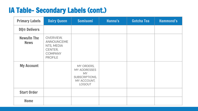
After we established what the customer base of North Park Creamery was like, we moved on to an analysis of their competitors. We chose a wide range of competitors, from those that also provide soft serve ice cream like Dairy Queen and Somi Somi to local ice cream competitors like Hammond’s. Below are our summaries.
Mood board
We then moved on to creating a mood board to help us get a better sense of the brand and site's visual identity, as well as picked site fonts and colors.

Creative Brief
We then began our creative brief detailing our plans for the site with general descriptions of the content, an outline of the site architecture, descriptions of audience, objectives, personality, tone, key target audience insight, and anticipated problems. We also began wireframing at this stage. Between the competitive analysis and creative brief, our ideas for the site architecture shifted leading to cutting a couple pages and functionalities. We deleted the online account pages and features as well as the “In The News” page. We realized that these functionalities did not match the client’s intent of an easy to maintain site.
Lo-Fi Prototype
We then moved onto our first lo-fi prototype and created a development plan for moving forward.
User Testing
We conducted multiple rounds of user testing while improving our lo-fi prototype. We got feedback from our client, our peers, our professor, and the customer base of North Park Creamery.
Our scenarios for testing the site were based on the information and use cases we gathered from our user interviews and client survey earlier in the quarter. We began by letting users explore the site, then walked them through specific scenarios on mobile and desktop, and then we asked them questions about their experience.
-
Take some time to roam about the site while sharing your thoughts with us.
-
You are planning to stop by North Park Creamery on your way home from work. Use the website to see if they are open and to decide on what to get before you go.
-
You are a big supporter of North Park Creamery and want to buy some merchandise. Use the website to purchase a zip-up hoodie.
-
You are a father of 3 hoping to treat your family on a small budget. Use the website to find out if North Park Creamery is within your budget.
-
You are planning a birthday party for your ice cream-loving friend. Use the website to book a space to host your event at North Park Creamery.
-
You are a vegan customer searching for an ice cream place to visit. Use the website to determine if North Park Creamery has ice cream you can eat.
-
You are someone who cares a lot about organic and ethically sourced products and only wants to purchase from places that share your values. Use the website to find out if North Park Creamery shares your values.
-
From your experience with the website, what kind of company do you think North Park Creamery is?
-
How do you feel about the filters on the shop and menu desktop?
-
How do you feel about text size?
Feedback Based Change Highlights
Here are some highlights of the changes we made based on feedback we got during our user testing
Color Palette
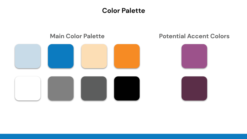
We started with a color palette picked from the brand's icon and previous site. During our initial client survey our client told us that they had already established a brand identity and color scheme that they liked and were not interested in changing it significantly. We did however, propose a new set of accent colors in case we needed to broaden the color scheme of the site.

However, we received feedback that these colors were too dull which made them both visually unappealing and did not match the brand identity. Thus we spent lots of time playing around with the color scheme before deciding on slightly brighter and lighter shades of the original palette without the accent colors.

Header Design
Headers are a key part of any site design but a function only approach often leads to them looking the same over multiple sites. We realized that a unique header is another impactful place to showcase brand identity by making it unique to your business. Our client's primary product is soft serve ice cream and thus we played around with various shapes to evoke ice cream related imagery, like dripping ice cream or chocolate toppings. Throughout this iterative process we went to our professor for feedback many times on what the shape and colors evoked for them and this helped us narrow it down to our final design. We eventually settled on a flat and simple drip design because the tradeoff of being less complex but distracting less from the content of the site fit more with the users' and client's objectives.
Key Previous Iterations


Final Version


Vegan Menu Section
Giving users easy access to dietary information was a key feature we defined early on both by our client and by us based on our user interviews. One way we aimed to achieve this was by highlighting the vegan options that North Park Creamery provided. Our initial set up was to have little V icons on options that were vegan in the menu and on the individual product page the vegan status would be called out.


However, this ended up being very undiscoverable for our users and was often missed in our user testing. To rectify this we added a key on the homepage, and gave the vegan items their own section in the drop down. After these changes, users were no longer missing the vegan items during our tasks.
Additionally, we decided to showcase two products per line instead of three. The tradeoff here was discoverability vs visibility. While three per line allowed for more products to be viewed at once and thus more discoverable, it also meant that product images and text had to be very small and hard to see and interact with. Given that most people would be interacting with the site on a phone, we decided that the tradeoff of easier interaction was worth it.


